I want to share a wonderful experience with you on what it was like for me as an artist to be completely taken out of my 'comfort zone' and loving every minute of it! Last weekend, I took a workshop on still life composition with well-known artist Maggie Siner. The workshop was organized by Brazier Gallery & Studio in Richmond where I had taken a workshop before and both the gallery, as well as the workshops, are of high quality. The reason I had signed up with Maggie's workshop was because her paintings look very loose and spontaneous. They show bold brushstrokes, yet are very harmonious and colorful. I would like to 'loosen up' a bit in my own paintings, which means painting less photographic and leaving more to the viewers' imagination. This would be the perfect opportunity I figured. And how right I was... On the list of suggested materials, there were a few items to bring to the class. Items of 1 solid color, no pattern, not shiny, but interesting shapes. OK, I can handle that....it took me about a week to put together a nice collection of objects that had those characteristics and when combined, would tell an entire story. A red wooden box, an old tankard, some big red onions, a few scallions and a garlic would be the perfect little still life I would render beautifully on the one large empty canvas that was also on the list of materials. Friday evening, after my 2,5 hour trip and a visit to the Virginia Museum of Fine Arts, we all gathered at the studio for a slide show and demo. Maggie explained her approach to painting. First, you do some sketching without confining yourself to a certain canvas size or dimensions yet! Look for the big shapes of light & dark, not just objects versus background. The light hitting the object will be part of the light area(s), as well as the light hitting the fore- and background, they will be part of the same light areas. The shadow side of the object will be part of the dark areas, as well as the shadows hitting the fore- and background. These light shapes and dark shapes have to be designed in a solid and balanced pattern. If there are too many small light spots in a dark painting or too many dark areas in a light painting, the composition will fall apart. It made sense to take a few minutes to establish a good light-dark design, but it definitely takes practice to divide your entire picture into either black or white. You have to decide which of the halftones (grey-values) belong to the dark shapes and which ones to the light shapes in order to achieve a solid design.
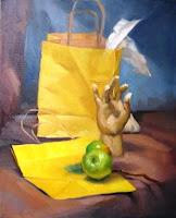
The next day we would put the brush to canvas ourselves. On Saturday morning, I had my first shock when I walked in the room. All my carefully chosen items had been placed onto several different tables to be incorporated in several different still life set-ups! There goes my carefully planned ‘story’ of a still life, I had to pick an easel and choose any of the still lifes that were put together with completely random objects! After a deep breath, I picked an easel, put my art supplies down, and then I noticed how Maggie had strategically placed the taboret (table for your palette) in front of the easel, which meant I could not get close to the canvas at all. I had to stretch my arm and use a long-handle brush to reach the painting surface, which does not allow for any detailing or ‘nitpicking’! The easels were also very tall, so there was no sitting down during this painting session….it forced us to walk back and forth and look at our work from a distance one would ‘normally’ observe a painting (hanging on a wall). After many different sketches and more demonstrations, on Sunday we finally got to paint on our large canvas (16”x20”). I had picked a still life with a wooden hand, two apples and two yellow paper bags. Maggie pointed out the diagonal from the curtain in the background, running down the fold in the paper bag along the finger and down to the table top. Stuck in my old habit, I focused solely on the objects and the background, and had not noticed the diagonal! After my initial sketch in raw umber to establish the light & dark pattern, I was allowed to put colors down. I felt I was painting an abstract, using big brushes, lots of paint and only ‘filling in’ the big shapes of light and dark. At the end of the day, Maggie came by again and I asked her what the painting needed. She told me it was a pretty nice piece, but it was too bad I had over-worked the hand and the apples. I stared at the painting in disbelief….over-worked? I felt like I was still painting an abstract, right? But…..isn’t the hand that ‘picked’ the apples the most important part of the painting, I asked? I thought it was OK to put a few details in the most important area of the ‘story’? Maggie shook her head and said: “no, your ‘story’ is not the apples, nor the hand, your subject or story of the painting is the play of light & darks hitting the objects and the background!’. Oops…..I guess it takes more than just one weekend to overcome old habits and learn to see things in a whole new light! Besides the workshop literally being an eye-opener, connecting with other wonderful artists who are struggling with the same issues is a great way to bond. Trying to put Maggie’s advice into practice on my own now, I’m already looking forward to the next experience to shake things up a bit…!
PS If you'd like to see some of Maggie Siner's work, visit: www.maggiesiner.com

 Last week, my husband suggested that I "google" my own name to see what information about me and my work was available on the internet. The idea had sparked my curiosity but I was a little apprehensive about the possible results. Not that I am leading a secret double life or that my life as an artist in a rural area is filled with dubious activities, but you never know if you are sharing your name with an ex-convict or a female go-go dancer. After typing in my name, I first come across my own website and a few other websites of art organizations and events that I have participated in in the past. After a few listings, I stumble upon a link to an artist's blog featuring a very familiar picture. I had to look twice, but it was definitely a copy of one of my earliest small still life paintings, entitled "Forbidden Fruit"! Someone had copied one of my paintings....!!! "Wow, a real forgery" I am thinking! What an incredible discovery!! But after the first shock, I realized, the artist had actually given me credit for painting the original and mentioned my name in full on her blog. (I guess I just lost the forgery case) Now, I felt a little pride swell in my chest...someone took the time and effort to copy and study one of my pieces. For a long time I've known of artists copying famous master pieces at the National Gallery and the Louvre, but I guess it never crossed my mind that my work would be copied for educational purposes one day...what an honor! Even though the artist herself was not completely happy with the brilliance of the colors in her painting, I give her an "A" for effort...way to go girl!! It's not always the final result that counts...it's the trial & error part that teaches us the most valuable lessons in life!


